Improving accuracy and transparency of payment details for small business customers.
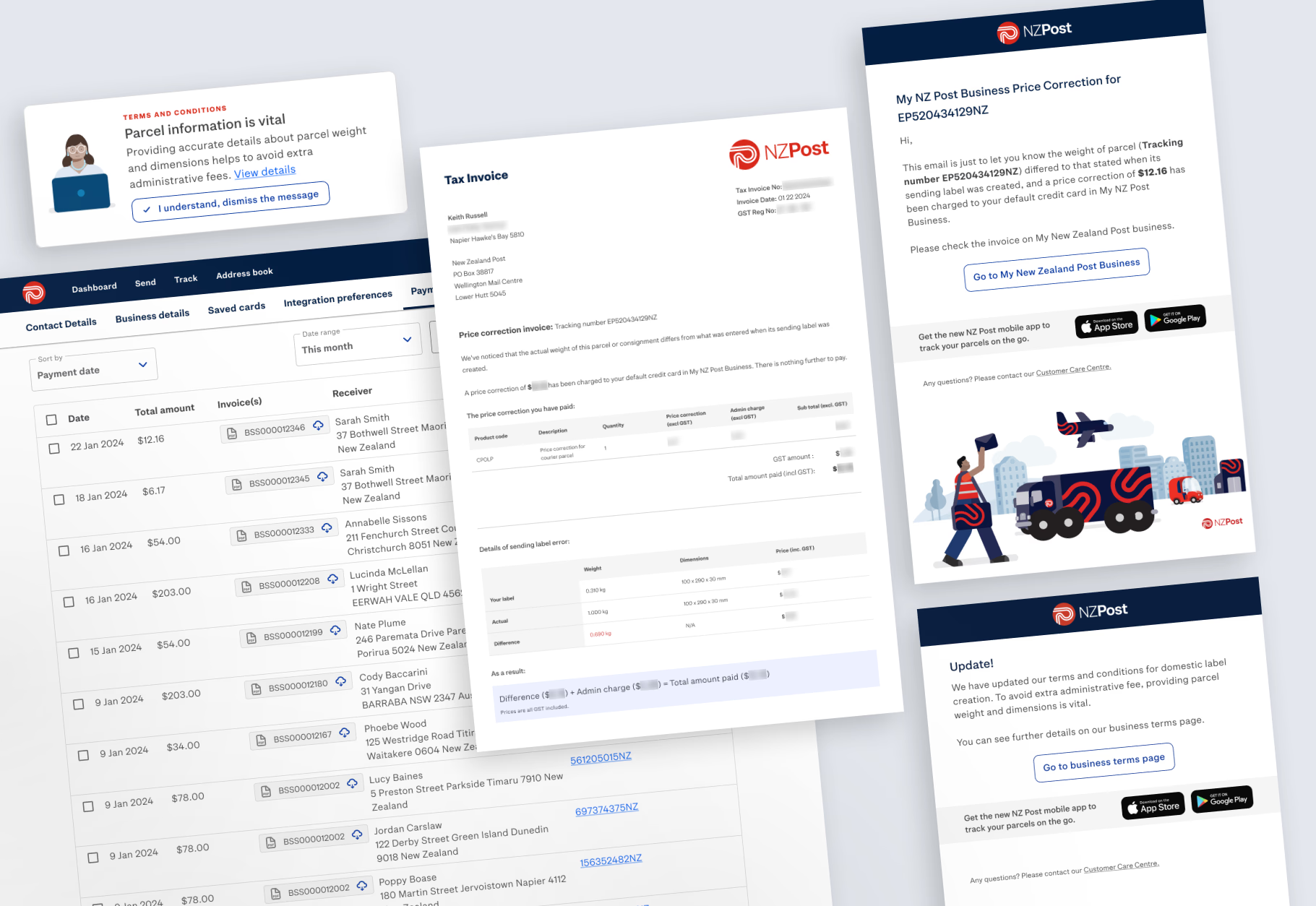
This project aimed to support clearer communication around service charges and reduce customer confusion caused by unexpected additional fees. Through research and collaboration, we identified key breakdowns in the customer journey and delivered design improvements across labels, invoices, and email notifications.
The estimated revenue impact is in the hundreds of thousands of dollars per year.
About project
- Product: NZ Post Business Self-Service Platform
- Duration: 3 months
- Platform: Web
Team composition
- UX/UI Designer (My Role)
- Self-service product squad
- Pricing Team
- Legal Team
My contributions
- Led UX/UI design
- Validated requirements
- Conducted user research
- Created wireframes
Employer
NZ Post is a state-owned enterprise providing postal and courier services across New Zealand.
Product
MyNZPost Business is a self-service platform for small to medium-sized business customers who regularly send parcels. Customers often ship between 50 and 100 parcels per week using this service.
One of the core features of the platform is allowing users to create domestic shipping labels.
My role
I was the sole UX/UI designer on the team and was responsible for identifying the user experience gaps and proposing clear, trustworthy design solutions to improve transparency in service fees.
Collaboration
I worked closely with the Product Owner and stakeholders from legal and pricing teams to align the design with compliance requirements and customer expectations.

Identifying the problems
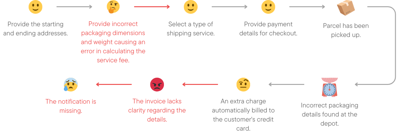
Many users were unaware that incorrect parcel dimensions could result in additional charges. When these charges were applied automatically, users often felt confused due to a lack of clear communication in the process.
We analysed product data and mapped out the existing journey, identifying where service fee corrections were triggered and where explanations were lacking.
Research and hypothesis
We conducted user research with 7 active customers using Maze. They reviewed simplified wireframes and responded to scenario-based questions.
Key insights
- Users had different preferences for receiving notifications depending on the type of charge.
- Official channels (such as the website) were preferred for initial payments.
- Email was preferred for explaining any additional charges.
- Some users wanted faster, more personal notifications for unexpected costs.
- Existing invoices were not clear enough to explain the reasons for the charges.
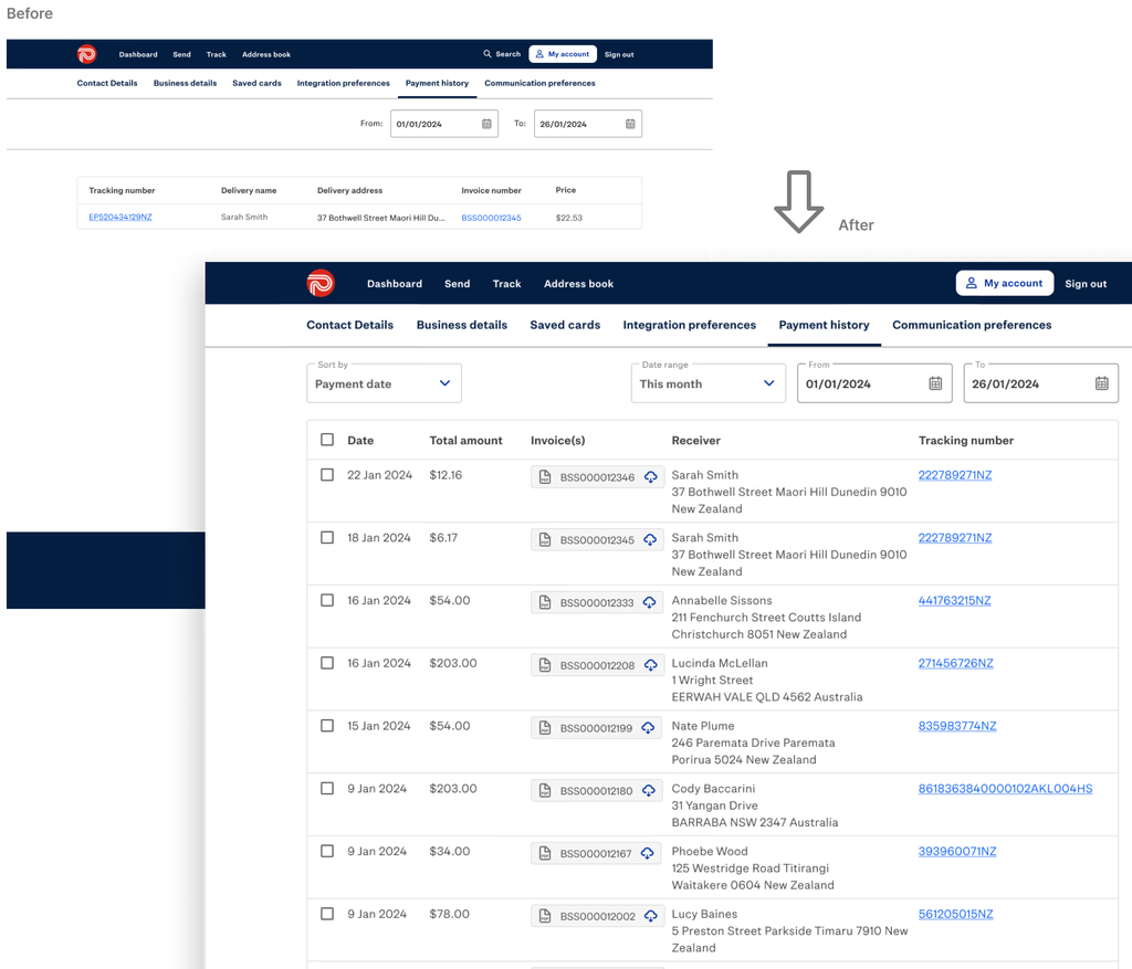
- There was demand for improvements to the Payment History page.
Design objectives
- Improve clarity and trust through better communication
- Reduce support queries caused by
- misunderstanding Give users visibility into what caused a correction charge
- Provide consistency across label input, email, and invoice touchpoints
Key design solutions
1. Preventing issues at the source
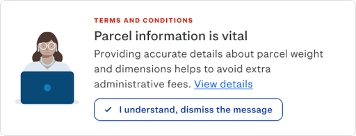
We added inline guidance during the label creation step to remind users about providing accurate parcel dimensions. This included a banner explaining that incorrect information may result in extra administrative fees.
2. Reimagining the invoice
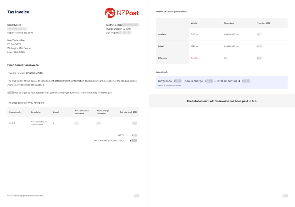
We created a clearer invoice layout, separating initial charges from correction charges. This helped business customers understand what changed and why it happened. The layout also better supported GST filing needs.
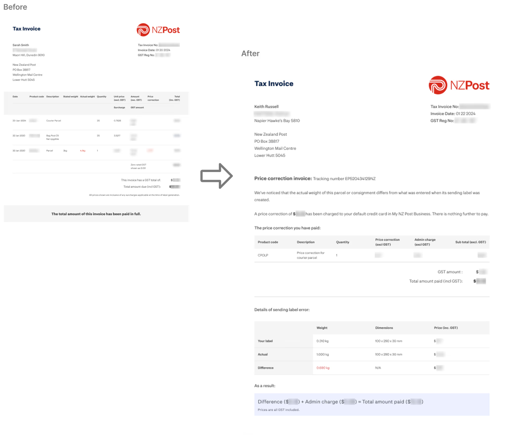
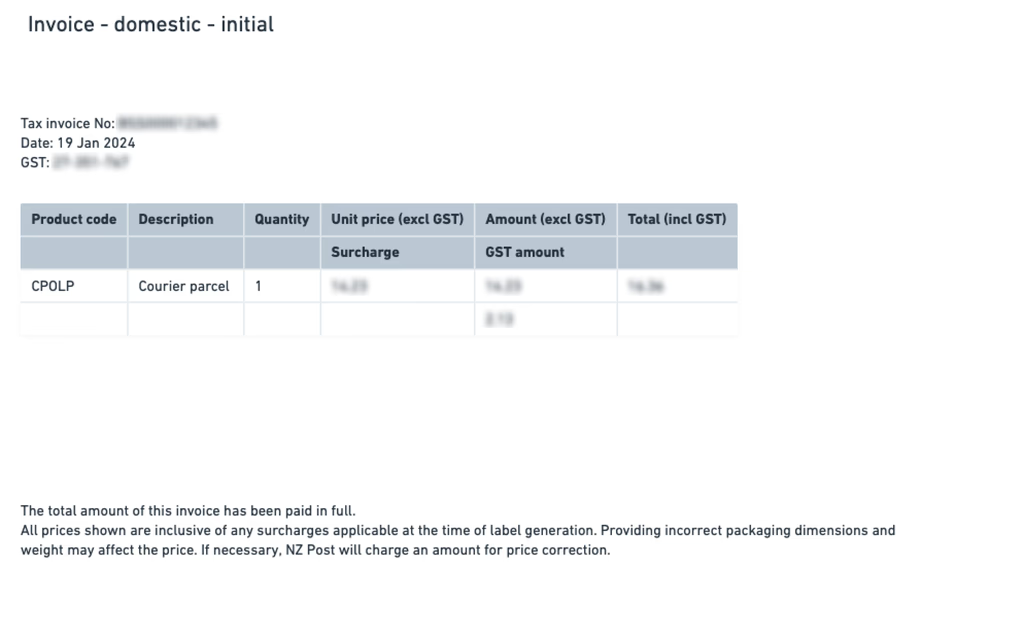
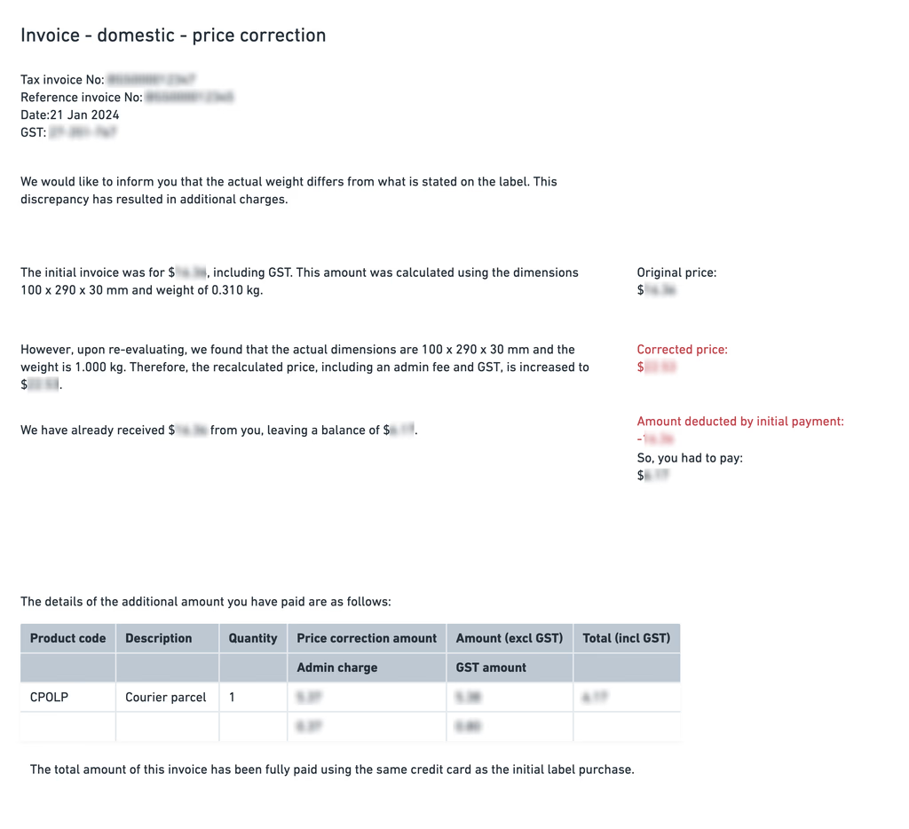
Afterwards, I transformed the idea into a visual representation. I suggested a 2-page layout utilising the existing code base and creating a visual break between what has been additionally paid and why it has happened.
3. Email redesign
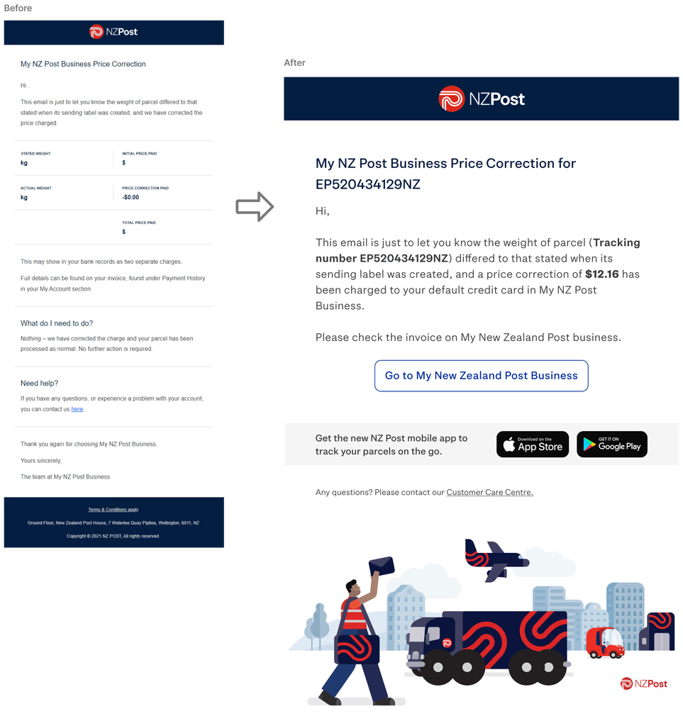
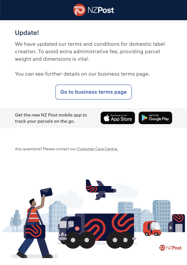
We rewrote the notification email to be more explanatory and less technical. The copy calmly explained the charge and included direct links to view invoice history and further details.
4. Aligning touchpoints
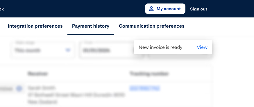
We designed a discreet in-platform message (toast banner) to alert users when a correction fee was created. This supported the email and invoice, creating a cohesive experience.
Notifying customers effectively
Keeping them informed
We created an email notification system to promptly inform customers about any unexpected charges in a calm and informative manner. The message includes clear details about the charge and a link to the payment history page on the platform. Within the timeframe, we focused on email template in this iteration.
Beyond requirements
Based on further insights, we proposed:
- Sending policy change announcements one month in advance
- Adding real-time visual feedback during the label input stage
- Revamping the Payment History page layout
Results
The implementation was in progress during my time on the project. By early 2025, NZ Post began publicly announcing updates to these service fee correction policies.
We suggested success metrics such as:
- Monitoring customer support queries relating to correction charges
- Conducting follow-up NPS surveys focused on clarity and communication
Reflection
I’m proud of how this work supported a clearer, more user-considerate experience without compromising business needs. Working within constraints, we addressed hidden frictions and created alignment across the product, content, and communication.
Looking back, the product could have benefited from even stronger infrastructure to support proactive solutions. However, this initiative marked an important step in the right direction.